This post is about a range of options for “deliverables” - types of output - from applied researchers in the industry. I found it helpful to be very explicit with people you hire and when prospecting projects about what the output of your research would be, what the different types trade off, and which of these you expect from researchers on your team (or the business units you work with expect from you).
A key point for me is that in the context of a business need for impact, these outputs are found on different spots along two axes: Friction to impact, and Leverage.
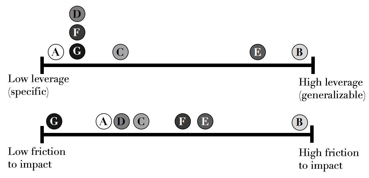
By ‘friction to impact’, I mean how much work is needed to actually have business impact from providing this deliverable. A report needs to be read, understood and a decision or action taken by its audience to be impactful; In the drawer it helps no one. A dashboard needs to be regularly used, while a fully automated, integrated system (e.g, some recommendation algorithm) already delivers its impact once integrated into the product.
Leverage, on the other hand, describes some sort of scope that the research solves. A very generic method can be applied to hundreds of cases; An SDK, used across many products (at least with the same programming language) - but a single analysis is limited to one decision at a set point in time (though that decision may turn out to be quite large!)
While not comprehensive, these deliverable types cover much of the output from a wide variety of substantive research topics and disciplines:
A) Descriptive analysis
This type is most similar to a published paper: It summarizes an exploration into a topic. It rests on driving a decision as its mode of delivering impact. Because often other people will make the actual decision and the changes it supports, the most important thing about a descriptive analysis is communicating it well. The expectation, should you end your project with a descriptive analysis, is that you are able to convince other people to take action with it. It doesn’t matter how sophisticated the method (in fact, a great deal of making the decision easier to take is that the method is not sophisticated where unnecessary, or decision-makers will justly suspect a type of method-dependence). It doesn’t matter how long and thorough it is (again, the summarized delivery must be incredibly short). A lot of what matters is the delivery.
Examples are an analysis highlighting a new way to measure the business unit that is more aligned with the actual goal it’s trying to achieve, or highlighting an opportunity that was missed in the data, or describing a new process, or deciding between multiple strategic options, etc.
B) A Method
This is also often encapsulated in a paper, but this output aims to generalize an approach to many possibly datasets or topics. A new method might have enormous potential impact. Imagine you found a more efficient sorting algorithm - but until patented or utilized on a substantive topic of interest, the method remains un-impactful for the business, however impactful it might be on the progress of science. The responsibility is with the researcher to ensure that many people repeatedly adopt the new method. This may be easier to bring about than the change that a descriptive analysis is trying to make, if the method is a widely applicable, practical one. This requires a lot of insight into what others are missing and an interest in persuading others to use the new method in their research.
C) A Dataset
A new dataset may be the result of a research, either through collection of new data or some preliminary analysis and transformation. It needs to be used in another analysis, dashboard or other output to become impactful.
D) A Dashboard
The automation of a descriptive analysis is a dashboard. It is only impactful if people use the dashboard, and so the dashboard needs to be useful: It needs to be easy to understand and use, quick to load, comprehensive in the insight it provides, and be an important part of the process that people undertake on an ongoing basis. The dashboard can be a new or more refined measurement, a monitor helping a new process happen efficiently, providing ongoing insight, etc. You trade the ‘one-off’ nature of a descriptive analysis for continuous ongoing impact, at the cost of effort: Creating the analysis in more robust code that is able to apply it automatically from new data as a report (possibly an interactive one).
E) A Framework
An API, code library/package or generalized executable which isn’t integrated in a product. Like a Method (B) embedded in code, this is again a step closer to leveraging the impact of your research but doesn’t, unless used within other systems, actually generate impact. However, the ease of integration and the general applicability of an API solving a set of problems create enormous potential for impact with highly reduced friction compared to only a method: With a framework, you don’t need to read a complex paper, and then implement it: You just call a function in an SDK or a web API to get the application of the research within your product.
F) A Proof-of-concept
The proof of concept is a step on the way to a standalone system (G), that is nevertheless not providing the impact by itself, but meant to demonstrate that it is possible to build a standalone automated system with the desired impact. In some cases, the scale of impact as a POC is tiny, and a scalable automated system is needed to grow it. In either case, a POC is similar to building a method in the sense that if no standalone automated system is actually built around the POC’s code, no business impact is achieved. It’s hard work to convince other researchers to use your method in their research, and it’s hard to convince business stakeholders to take the action you propose in your descriptive analysis, or use a dashboard you built. But my experience is it’s probably even harder to cobble an engineering team to build your POC into a product/system, without very strong buy-in and explicit understanding in advance that the scope of your work is going to be a POC. There are many labs, teams and companies organizing around researchers building POCs and engineers building them into systems [1]. In my experience, this was the root of several organizational problems and I strongly and expressly avoid POCs as an accepted form of output for my own research teams: All other forms are legit, except I don’t find POCs are ever useful except as a milestone the researcher then goes on to turn into one of the other forms – usually a framework or a standalone/integrated automated system.
G) A Standalone, automated system
This research output is a piece of code, either standalone or (preferably) fully integrated with a key system/product that utilizes some research product to deliver impact. This is often the most impactful form of research, because it both increases the frequency and duration of the impact, and reduces the barriers to adoption to virtually zero. In the classic examples - e.g a classifier making decisions by itself, or a system automatically exploring a space of experiments, or an algorithm deciding the optimal ad bid - it essentially automates and streamlines the decision-making that humans might do with dashboards or by reviewing analyses. It does away with a lot of the dependencies to achieving impact relied upon in all of the previous forms of research: The need to communicate, convince people, or rely on their ongoing use of your research, and instead takes on the responsibility to deliver the impact itself.
In organizing these outputs, I think two axes are interesting: One is the potential scope of impact, or “reach” of the output. The other is the barriers/friction to creating the impact, and how dependent it is on others or the researcher’s future action. These are somewhat but not entirely inverse. The actual impact also, of course, widely varies with the substantive topic at hand, and of course depends on the research being correct, relevant, successful, etc. So for instance, it is perfectly sensible to choose to work on, and drive more impact from a “low-reach”, one-off descriptive analysis of how to use your company’s spare cash than a complicated method that makes some specific computations more efficient by 0.1% in rare cases, even though in my theory I place ‘methods’ as some of the highest-potential-scope output. But when several of these are applicable, and in the same topic, this may explain why I prefer a system with its “0 friction to impact” and decent reach, over a Proof-of-Concept with only marginally more potential applications and much more friction.
A great applied (industry) research organization constantly drives to further the fulcrum its projects create - driving towards bigger scope, generalized outputs, while simultaneously successfully impacting the business by driving the friction down or taking accountability of and ensuring the impact is realized, often with followup work by the same researcher.
Another aspect that I’ve ignored so far, is the amount of effort required. I avoid ordering these outputs by effort, however - I don’t see how to argue about it coherently nor is it the same for different people with their different preferences and skills. The only general case I see is that a POC must take less effort than a full system, by definition. For the rest, the effort required is on different, incomparable scales.
The key point I try to make is a conscious choice of output needs to be made - and very clearly communicated - as a researcher or manager, and it needs to be explicitly understood by your colleagues and business partners. Significant difficulties that researchers, their managers and their clients experience, in situations when they are all new to the relationship, arise when the researcher expected to build a POC when the business partner wanted a standalone automated system, or the researcher wanted to work on methods published as papers when their managers wanted the team to build frameworks. So I hope this post gave you a language to explore these.
–
[1] In some cases in the industry, there’s a separation and violation of the original meanings of roles: Engineers were sophisticated implementors figuring out solutions to practical problems - like landing vehicles on the moon or devising steam engines. They were doing applied research, and they definitely didn’t either abstain from the learning and experimentation of research nor the drive to build a fully working solution. I find in some cases in tech we’ve created two classes of people that want to do either one (exploration) or the other (building proven things to spec) but not both, and the result is a problem of division of labor (that I might discuss in another post).
]]>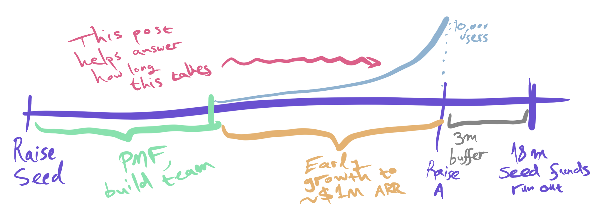 The three steps of a classic seed round: Search for PMF, Early growth, and fundraising.